Tesla Model 3 Highland First Look: Interior and Exterior Review
The Tesla Cybertruck may have stolen the headlines (yes, even ours), but it’s not the most important new product Tesla has launched in recent months. Last fall, Tesla also revealed its first significant refresh of its game-changing sedan, the Model 3. It’s referred to as the Highland, and I got up close and personal with one at Chicago Auto Show. And while I didn’t have a chance to drive it, some of the biggest changes are simply to the exterior and interior, which is discussed here.
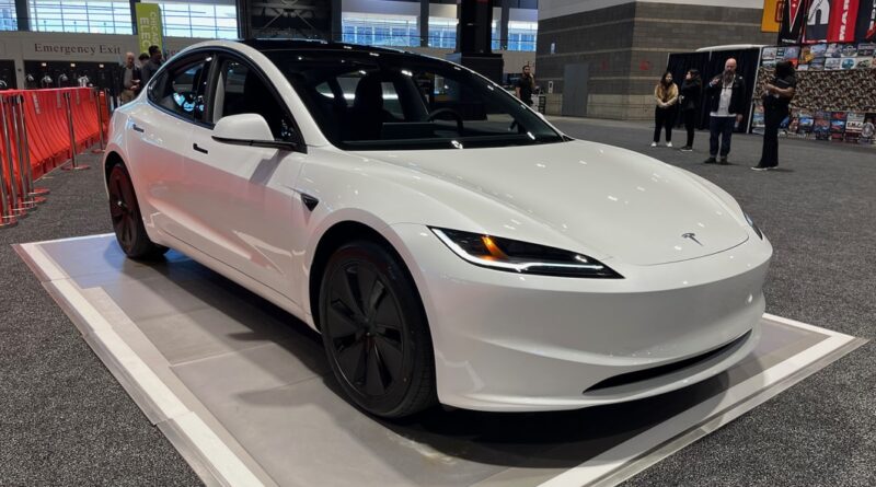
There’s not a huge amount to report regarding the Model 3’s body. The big change is to the front fascia, where it features a new bumper and headlights. Instead of the upturned snout we’ve seen for years on the 3 and Y, the Highland gets a far more ordinary, straightened out nose. The headlights lose their boomerang shape, too, and get crisp little corners at each end. It’s far less distinctive than before, but simultaneously seems more handsome; a lateral move if anything. The tail gets a slight tweak, too, with C-shaped taillights. They’re a bit more interesting design-wise, but they’re also super easy to miss.
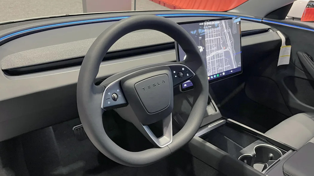
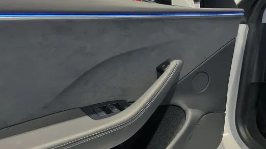
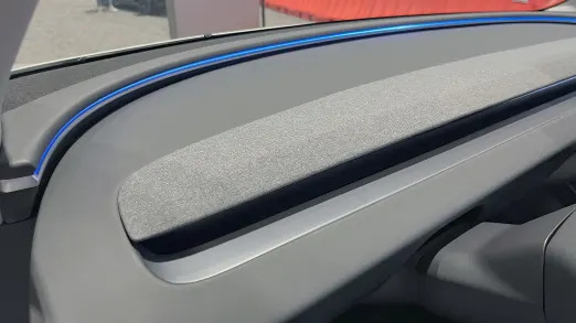
So it’s time to hop inside. With a combined press and pull of the flush door handles, the Tesla reveals an interior that definitely looks similar to its predecessor. But give it a moment, and you start noticing the changes, and they’re actually quite welcome. The most noticeable change is the long, arcing ambient light strip that carries from one door panel, up and around the dash to the base of the windshield, and back around to the other door panel. It’s reminiscent of a similar arcing trim piece from the late Jaguar XJ. The lighting can be customized, too. It all adds some welcome visual interest to the dash, rather than simply being a featureless shelf. This is probably the best application yet of Tesla’s uncompromisingly minimalist interior design.
Somewhat strangely, though, Tesla no longer seems to offer a wood grain dash trim. They’ve opted for a fabric-covered panel instead. It’s nifty, and we generally like seeing upholstered panels in other cars, particularly with unique fabrics. But it’s a little disappointing to see the wood grain option go away, as that helped bring some welcome warmth to Tesla’s fairly cold aesthetic.
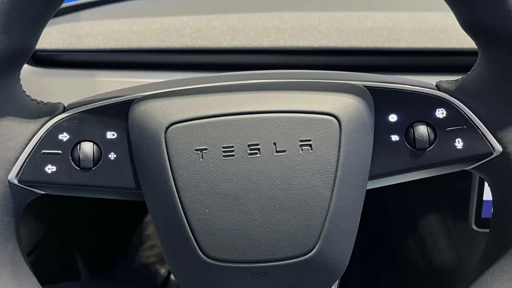
Another change to the Model 3 Highland is the steering wheel. Tesla has ditched stalks for functions such as turn signals, opting instead to use steering wheel buttons. While we’re fans of buttons, not for turn signals. Nevermind that we’ve all been programmed to use turn signal stalks, their advantage is that they remain stationary when turning the wheel. You always know where they are. By contrast, the Highland’s turn-signal buttons are constantly moving. We mentioned this on the Cybertruck as well, but that’s less of an issue because it has fast-ratio steer-by-wire, which means that you’re far less likely to turn the wheel over multiple times, and can likely keep your hands in the same spot on the wheel most of the time. It’s just a silly decision done in the name of minimalism (but really cost cutting) that doesn’t contribute significantly to that theme. And to be fair, they aren’t a good idea in various Ferraris, either.
The rest of the interior is pretty much the same as before, and it has its ups and downs. From the driver seat, there are some great ups. Forward visibility is spectacular. The low hood, dash, door sills and thin pillars all provide an amazing view out. It’s bolstered by the oddly high seating position. There’s loads of space in every direction for those up front and the seats themselves are quite supportive with plenty of adjustment. On the other hand, there’s still the awkward lack of fine adjustment to steering wheel position due to the nature of the thumbwheel controls used to adjust it.
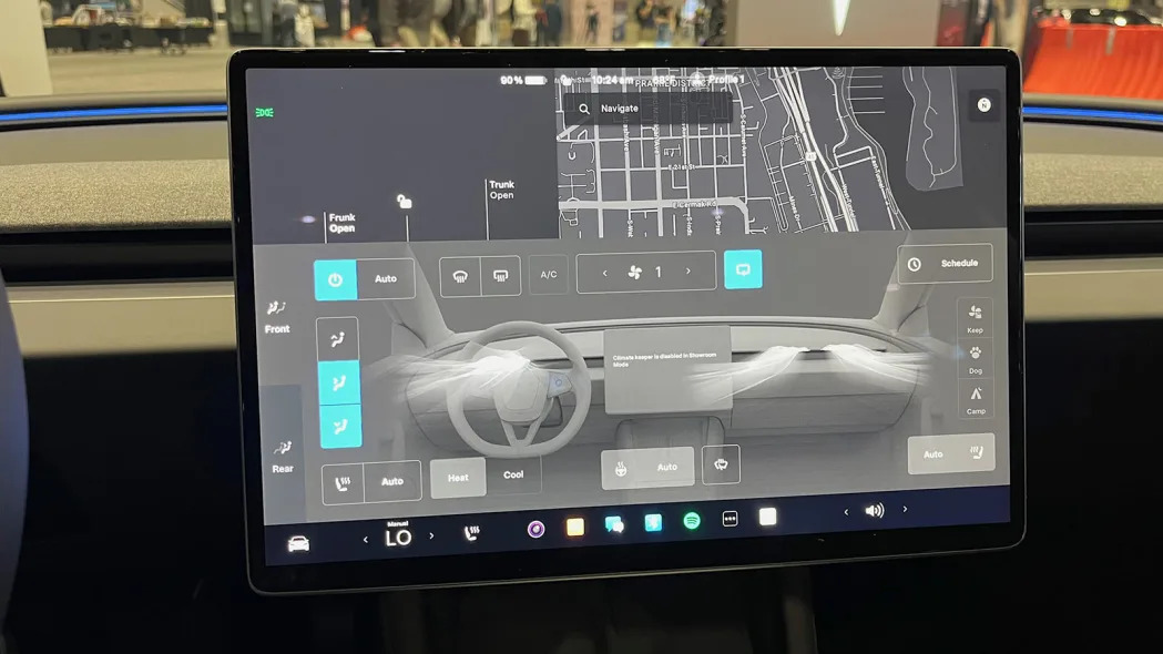
The big 15.4-inch touchscreen in the middle of the dash is a mixed deal. It’s an excellent screen, with superb brightness and response. It does have fixed shortcuts at the bottom, which is good, and it’s important that it is such a good screen because it handles absolutely everything, including instruments. Having driven a Model 3 before, the instruments on the center screen are more usable than you’d expect. But it’s annoying that the Model 3 still doesn’t have a head-up display.
The back seat is more of a negative for the Model 3. You sit close to the floor, and combined with a lack of space under the front seats for feet to slide into, it’s an uncomfortable position for adults, leaving legs a bit scrunched and raised up off the seat base. Head room is also a bit tight. The glass roof back there almost seems necessary to make it adequate for adults. But if you fit decently in the back seats, the seats themselves are fairly comfortable with decent support and cushioning.
The Highland’s new 8-inch rear touchscreen is another odd one. It’s another very nice screen, and it allows rear passengers to control rear climate functions as well as info and entertainment. You can even play some mobile games on it. But it’s rather small for entertainment purposes, and it’s mounted really low. It would be uncomfortable to stare at for long periods of time, and requires quite a bend for adults to reach it. Considering that turn signal stalks were ditched for minimalism/cost, it’s amusing that Tesla added this second screen when its functionality is minimal and occupants have their phones to keep them entertained.
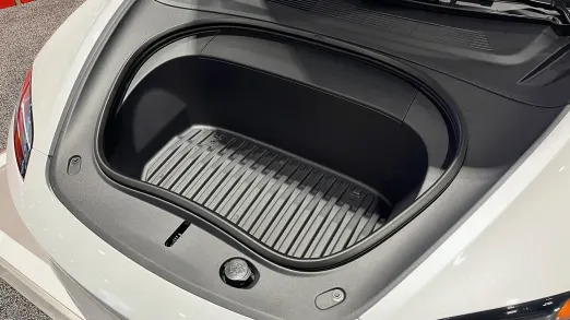
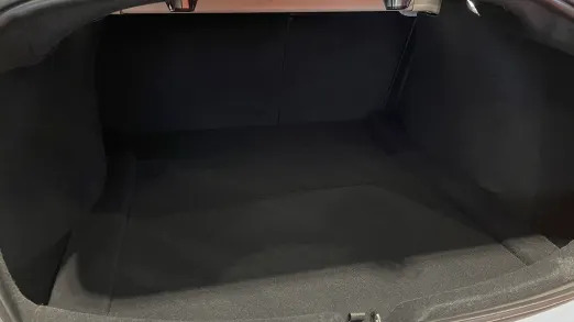
Cargo space isn’t really changed for the Model 3, but it features both a trunk and a frunk. The trunk is a rather generous 21 cubic feet. The frunk on the other hand, is smaller than you might expect just looking at the outside of the car. It’s only 3.1 cubic feet, so it’s likely best for holding your charging cables and maybe some emergency odds and ends, rather than regular cargo use.
The Highland redesign of the Model 3 has also added some extra features, such as blind-spot warning, acoustic glass, an upgraded sound system, additional range and more. You can read more about that in our initial reveal story. There are apparently some tweaks to the suspension tuning to be more sporty. But we can’t tell you the effect of that without getting behind the wheel. And as you may know, Tesla does not provide press cars to test. So that will have to wait until we can borrow or rent a Highland Model 3. If you have one and would be willing to let us take a spin, we’d love to hear from you and would like to possibly work something out. We promise not to break it.
Related video:

